My four-year-old niece recently drew a picture of me.
At best, I would describe it as average. It bore no direct resemblance to me (I was green and taller than a house), but you could at least tell that she had some sort of grasp of the basic principles of composition. A solid four out of 10.
Of course, I didn’t tell her that. I lavished her with (undue) praise, proudly stuck the grotesque impression of me on the fridge and gave her an ice cream as a reward.
To my mind, a similar scenario is currently playing out across the out-of-home (OOH) industry – campaigns being endlessly applauded for doing little more than getting the basics right.
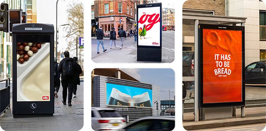
LinkedIn and trade press have been awash with praise for an (apparent) new style of OOH advertising, commonly referred to as minimalist OOH. You know the sort of thing: big, bold use of distinctive brand assets; minimal direct brand signals.
Read a post featuring one of these ads and it will inevitably be accompanied by comments like “so brave”, “so bold”, “what clarity”, “what focus”.
But is such praise really justified? Or do these ads simply stand out because they manage to get the basics of poster design right in a world where most people get it terribly wrong?
I would argue the latter.


